The Poetics of Ukrainian Typography and Graphic Image of KHUDPROM: 100 years of Search
Ultimately, the science of drawing
consists in establishing the relations
between curves and straight lines[1]
One day, while strolling in London in the evening with the Penguin Books designer David Pearson[2], we reached the Farringdon Underground Station. “Do you see this beauty? Now you will understand London better,” said David, pointing to a huge wood alphabet monument devoted to the typeface designed by Edward Johnston[3] and Eric Gill[4] for the London Underground.
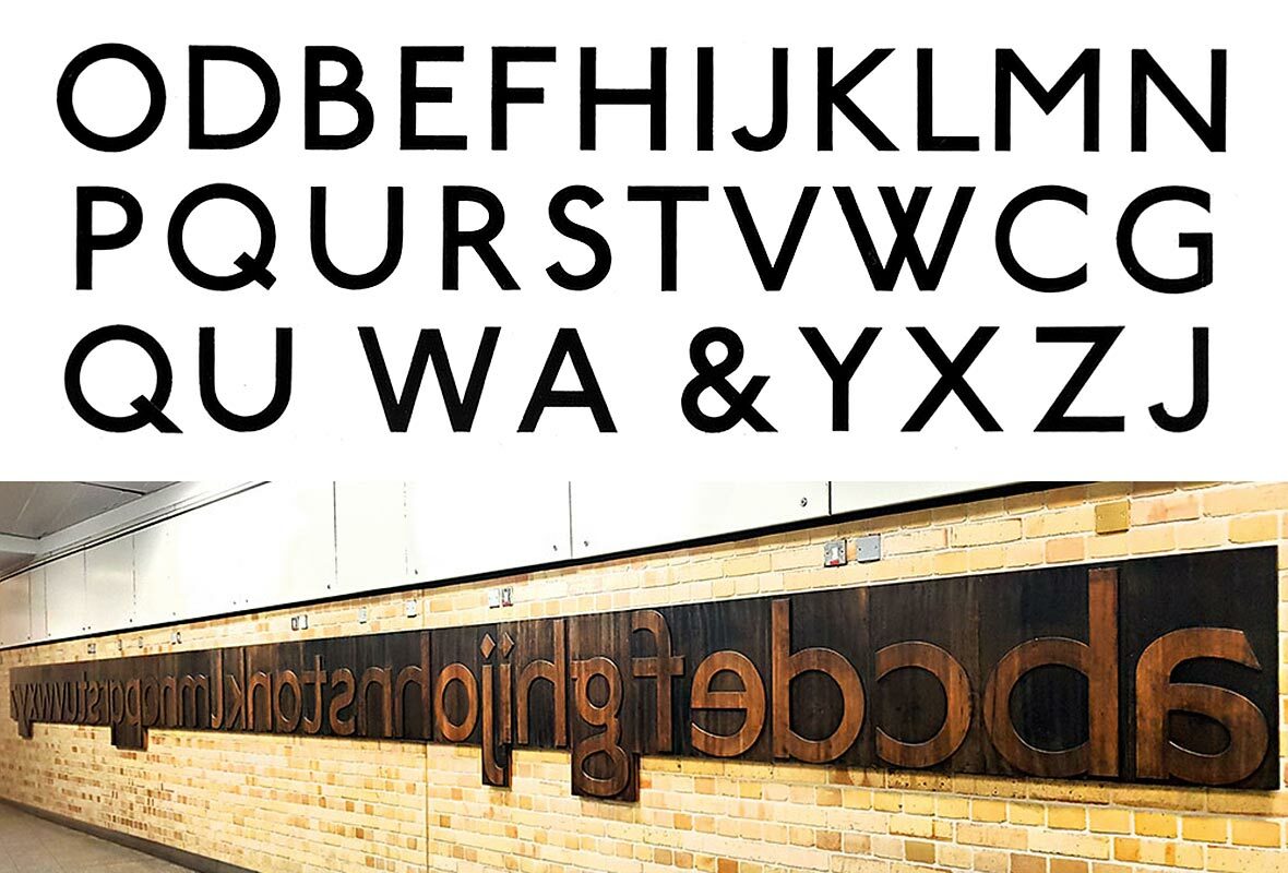
These letters have become part of Great Britain’s visual image, making it impossible to imagine London without them[5]. An average Underground passenger, however, would hardly know where this typeface, which they see every day, came from. Such a passenger would not realize that the proportions of the inscriptions he sees daily are based on Roman monumental epigraphy, which has lost its serifs and embraced the speed of industrial times, smoke of steamboats above the Thames, and heavy factory gears. How do such associative links between a simple letter shape and some specific place or time emerge?
A Dutch designer Gerard Unger[6] addressed similar tasks in his Alverata typeface. Based on the shape of Roman letters, he has created a modern type, where we can see the influence of squat churches of Lombardy and Pisa and, at the same time, the esthetics of the forms is invaded by the autostradas of Toscana and the silhouettes of Northern Italy’s constructivist architecture.
Albert Kapr noted correctly on this matter: “The pictures of our alphabet still retain some vestiges of the interlacement between the roots of past writing systems, of hidden meanings, of such elements of sign morphology, we are now unable to perceive consciously.”[7]
And now it would be the time to consider whether there are such typefaces in the Ukrainian culture, which tug at heartstrings and remind of something rooted in the national tradition.
It seems to me that presence of the traces of place and time in the writing’s esthetics is determined by several factors. Sometimes, these are historically conditioned graphemes and structural specifics in the development of a given writing system. We can implicitly see the Ukrainian character in the dashing Cossack letter K, which is written in one stroke, or in the letter У with a “bagel” instead of a drop, or in the Greek letter N, lost inside a Cyrillic inscription[8].
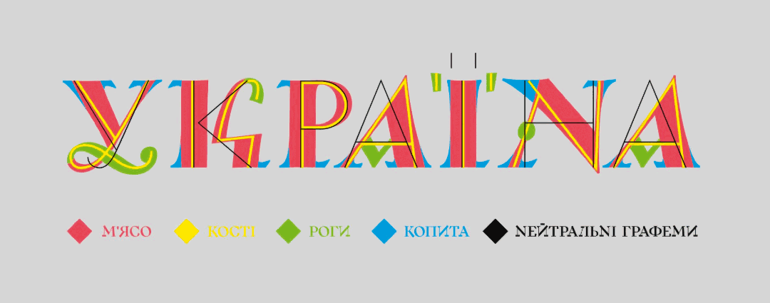
In his recent article in the TELEGRAF journal[9] Dmytro Rastvortsev gave a very colorful and apt description of the bones, meat, hooves and horns of Ukrainian alphabet: Replicas of uncial and ornate cursive writing, asymmetric serifs, picturesque contrast, strokes and loops, as well as the graphic freedom, which would sometimes encroach on text’s readability. One would be hard pressed not to recall Anatoly Petrytskyi’s book cover for a collection of poems by Mykhail’ Semenko[10]. The book’s title is on the edge of legibility and picturesque blobs can hardly be recognized as letters. Dmitri Gorbachov has noted that the artist probably used it as a parody of Narbut proponents’ admiration for ornate cursive writing of the 17th century[11].
It should be noted here that starting in the 19th and during the whole of the 20th century, we find ourselves in permanent uncertainties and search between the extremes from severe geometry to the convoluted hedges of Cyrillic wicker fences and the tied bundles of Cossack scribes’ signatures. These font seesaws are depicted masterfully in a book by Volodymyr Krychevskyi and Oleksii Dombrovskyi, entitled Two Fonts of One Revolution[12], where running over from the avant-garde modular typefaces and to the ornamental luxury of Sergei Chekhonin’s[13] letters, there is a space for creativity and innovation.
Sometimes, that or other extraneous fashion or trend can play the role of time dominant. For example, modernism of signs on Kharkiv streets or book covers in early 20th century has organically entered the cultural environment and fell in a fertile Ukrainian soil, while being overgrown with Ukrainian ornamentation or blossoming character. Similar processes took place concurrently also in architecture. In his Ukrainskyi styl (Ukrainian Style)[14] series of video sketches about Ukrainian modernism, Maksym Rozenfeld has aptly shown how a common European art style is acquiring some national or local traits.
Sometimes the personality of some individual artist sets a certain trend, which is inextricably linked with a specific epoch. Here we could recall Adolphe Jean-Marie Mouron (Cassandre)[15], an almost Kharkivite, who had lived in our city until the age of 14. He was designing his typefaces specifically in 1920s and was very successful in catching the spirit of time. His two-component chromatic typeface has been recognized as a veritable icon of art deco and resonates to some extent with the Kharkiv avant-garde and the fonts discussed in this article.
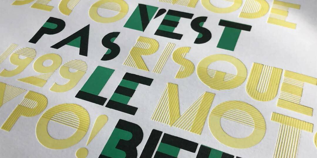
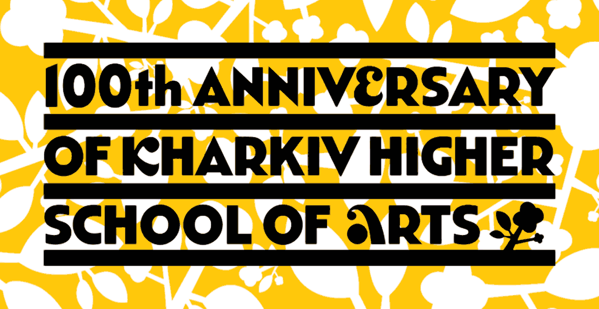
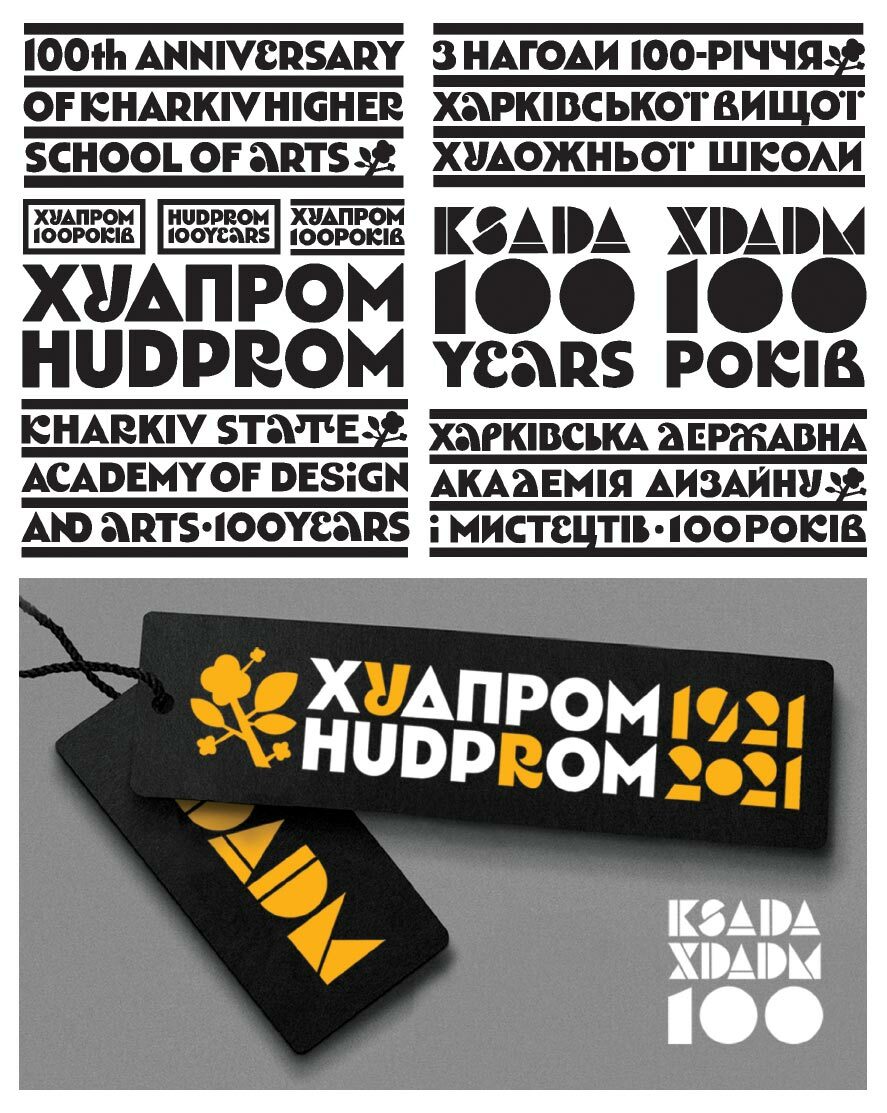
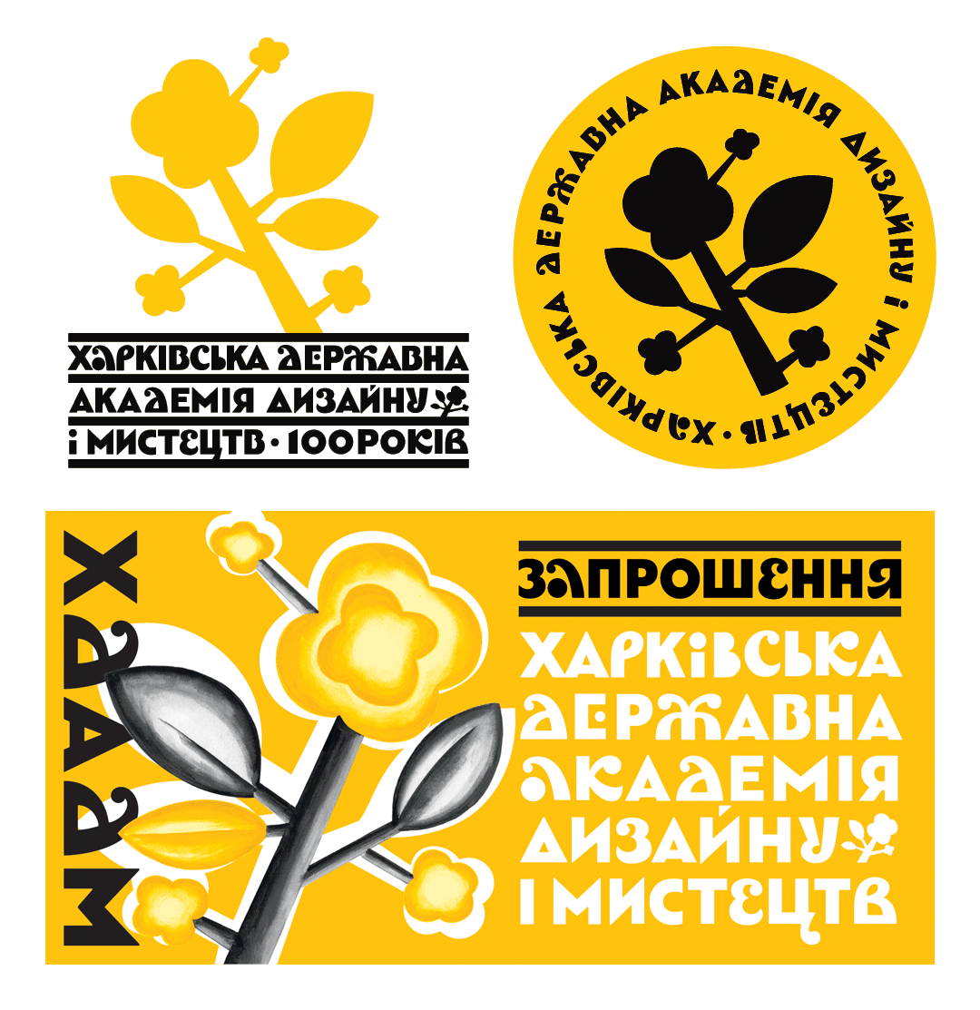
When by a stroke of luck it turned out that I had to create a graphic for alma mater’s centenary celebration, it certainly was imperative for me to decide as to what period I should choose as the benchmark and what I should take as a basis stylistically in my typographic search. Of course, I could have continued with the line of designs used in previous anniversaries. The emblems for the 50th anniversary (A.Kuzmenko) and 75th anniversary (V.Shevchenko) both stayed with the tradition of Heorhii Narbut and Robert Lisovskyi. The engravings of the teremok[16] (small tower) and ornamentation in the spirit of Ukrainian modernism emphasized well the connection of the Kharkiv School with the common Ukrainian identity. However, I wanted to not only reveal the Academy’s founding time in the 1920s, but also the powerful and creative movement in Kharkiv, which was behind these events. I wanted to be inspired by the pantheistically optimistic fervor of the Union of Seven and pick up the original artistic melody, which was in unison with the city and the time, rhyming its search with the words opening the 7+3’s program album From Us Connected by Youth Only[17]. I believe it’s a good motto for a centenary!
If we look into the font catalog published in Kharkiv in 1923, we will see a lot of typefaces left over from previous epochs, such as script types, antiquas, and pre-futurist sans serifs[18]. An example of how artfully one could juggle the available set of fonts from diverse stylistic worlds can be seen in a series of posters for the Berezil’[19] theater, which – the whole avant-garde hodgepodge notwithstanding – all looked very coherent and loud. When even this was unavailable, however, then “everything was published in a very futuristic manner: There was no money, no printing house, paper or font. There was only enough poetry, articles etc. Sometimes we did as follows: Rented a small basement room; somehow got hold of a printing press for business cards, borrowed font from some printing house and – printed.”[20]
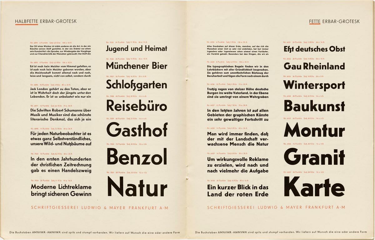
This kind of austerity, poverty plus censorship control over independent publications already in the post-revolutionary period – all have produced a number of special features of the Soviet graphic design. The domestic artists were less skillful and professional in creating moveable types compared to lettering and book covers. They lacked the calculations, technological facilities and knowledge of their Western colleagues who simultaneously designed angular fonts from grotesques by H.Bayer (1926), J.Schmidt (1925), M.Burchartz (1925) and to such hits as Futura by P.Renner (1930) and Erbar grotesk[21] by J.Erbar (1931). However, one could feel the romantic impulse and unusual plastic thinking in the painted inscriptions and names, where letters found character, changed alongside other letters, and created an intricate conversation among themselves[22].
Incidentally, the graphic poetry of Pan-Futurists has a certain resonance with the figurative verses by Symeon of Polotsk, Ivan Velychkovskyi, and applied art of students of the Kyiv-Mohyla Academy. Sometimes, they went even further in Kharkiv and made all illustrations using movable material only. I.Kruhliakov, a typesetter with the Kharkiv Printing School published a brochure in 1926 under the title Drukarski zastavky I kintsivky z midnykh liniyok z dodatkovymy virshamy [Head ornaments and tailpieces from copper rules with additional verses].
If we carefully analyze the multitude of avant-garde book covers and designs (mostly Russian) collected by V.Krichevskyi[23] or the New Typography trends present in Europe, e.g., in Poland[24], and compare them with the Ukrainian futurism, we could notice that the common typography laws or lawlessness are overlaid by a significant influence of font solutions related if not to calligraphy, then, to the memory of pen and brush movements. Softer, gentler, freer is the way I could describe the graphic trend of those times. Either its ties to the folklore life-affirming principles, or the picturesque culture basics prevented the Ukrainian art from getting used to the esthetics of an ugly or tragic dissonance.
In any case, despite the international modernism revolution in Ukraine, each individual instance and place had their own reflection and refraction not only in painting, but also in graphic design[25].
Contemplating the matter in this way, I have come to the conclusion that, on the one hand, such typeface should not be too historical and have no patina of apparent calligraphic or floral modernist twists but, on the other hand, this must not be a sterile typeface with a minimalist design similar to the Swiss school. Fonts “without memory” in the spirit of esthetic unisex in vogue today are much too unsuitable for the picturesque Ukrainian narrative whose emotions run high and for a flourishing sense of space.
Searching for letter forms I was guided by the humanistic sans serifs of the Erbar grotesk, Gill Sans type, and more modern replicas, such as Telefon. Borys Kosarev used similar stylistics on the covers of the Teatr, literatura, muzyka, balet, grafika, zhivopis’, kino magazine[26].
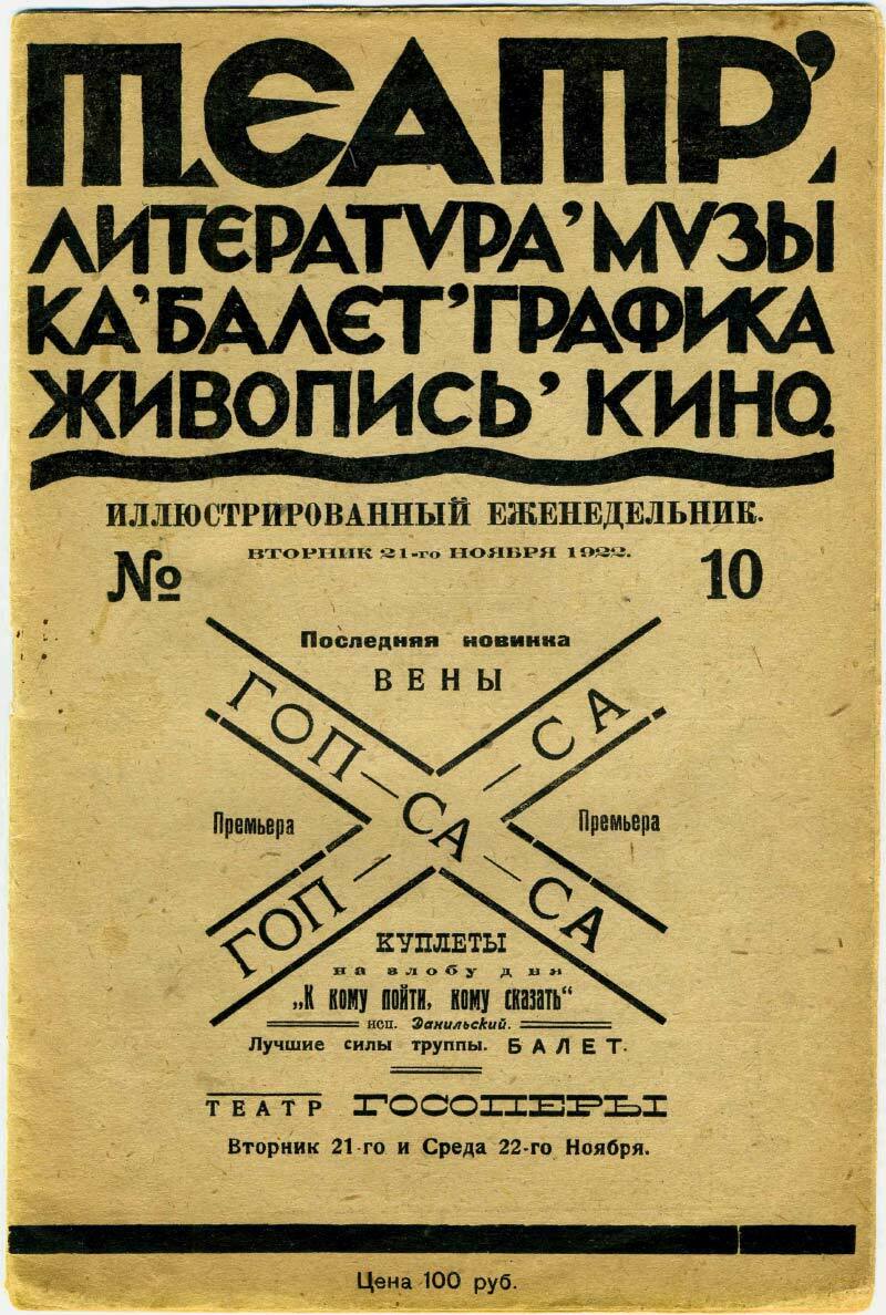
Powerful letters create the feeling of both emotional drive and merry fervor. My work has also been influenced by the art of Sviatoslav Hordynskyi with his sensitive attitude to letter’s silhouette and interplay between white and black inside the text.
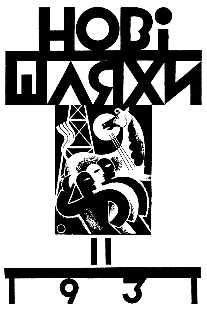
Of course, I could not but use the typographic covers by Vasyl Krychevskyi[27] in my work. His geometrical compositions with an obvious influence of art deco in the shifted middle elements of K, H, A, open forms of B and C also transmitted the constructive thinking of the epoch. However, in the sketches made I missed some tactile and alive sensations from the letters.
Borys Kosarev’s daughter Nadiia once told me about her father’s account of designing the caption for the 7+3 catalog’s cover. He wanted to paint letters on which glass fell and cut their form. This approach testifying to a spatial, almost sculptural attitude to the caption, about the attention to the form’s texture, and leads us to the issues raised by Adolf Hildebrand dealing with the fernsichting (far image) and tactile relief memory[28].
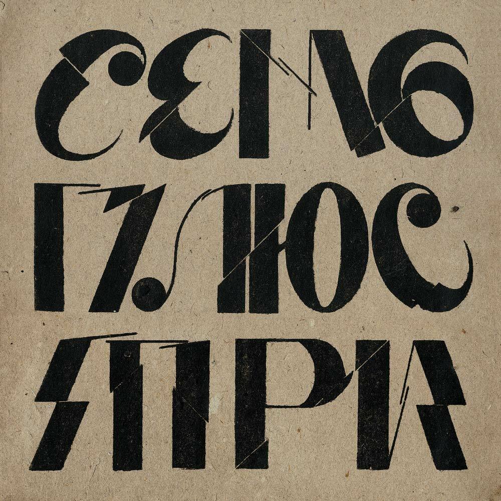
One of the members of the Union of Seven stated in a polemic fervor: “He who does not paste newspaper sheets, fabrics, cigarettes on his painting; he who does not insert pieces of wood and metal into it; he who does not stick real knives and forks into it – in a word, he who fails to provide real texture – he is not modern.”[29]
The collage approach could be seen not only in Vasyl Yermilov’s paintings but also in his letterings. For example, the design of verses by Velimir Khlebnikov.
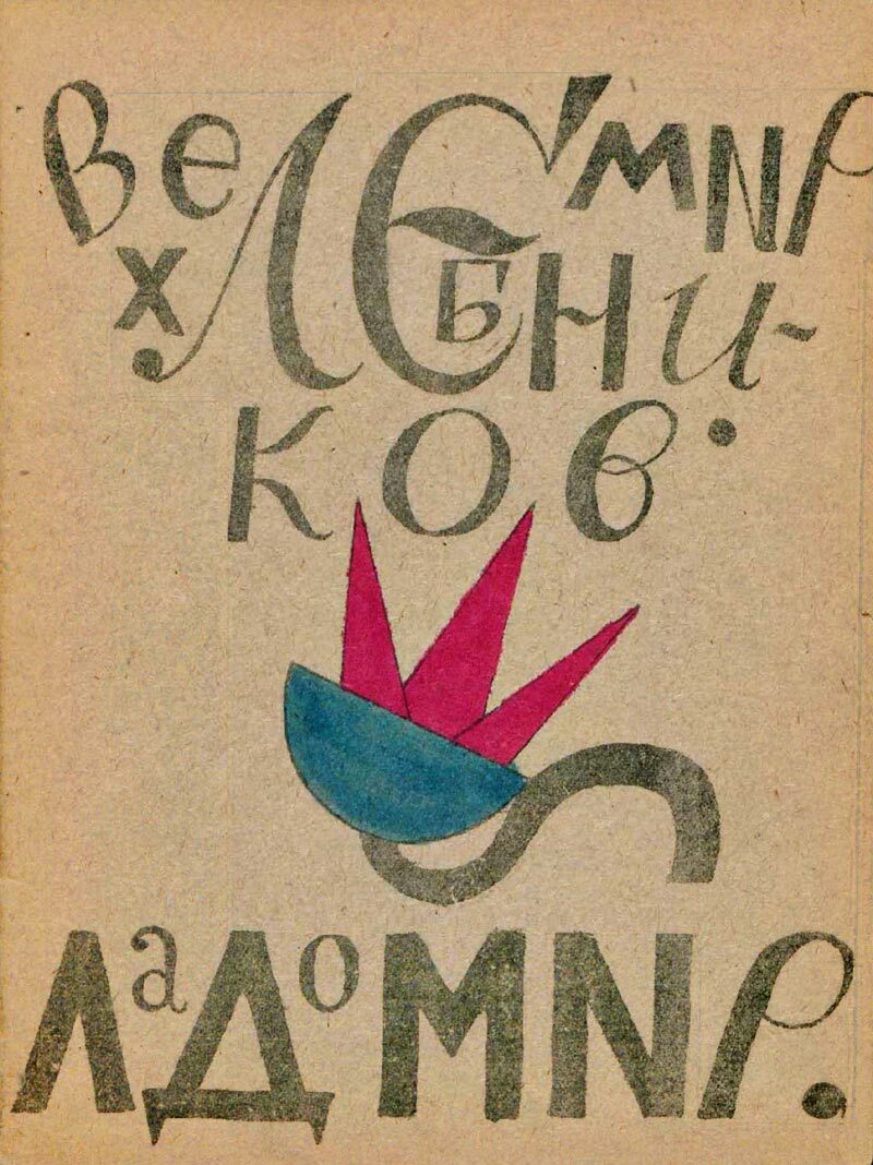
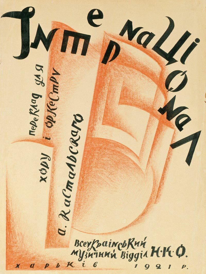
It mixes various graphemes and letter styles, and in the sketch for the International there happened some extraordinary feast combining the constructivist forms and calligraphic elements.
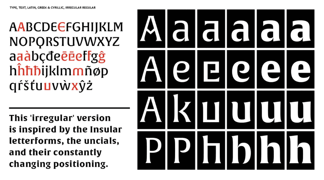
I have decided to follow the path opened by the Union of Seven. I proceeded to supplement the core character set with historical or experimental letter shapes. For example, E has eight different variants – from very avant-garde forms to those almost cursive.
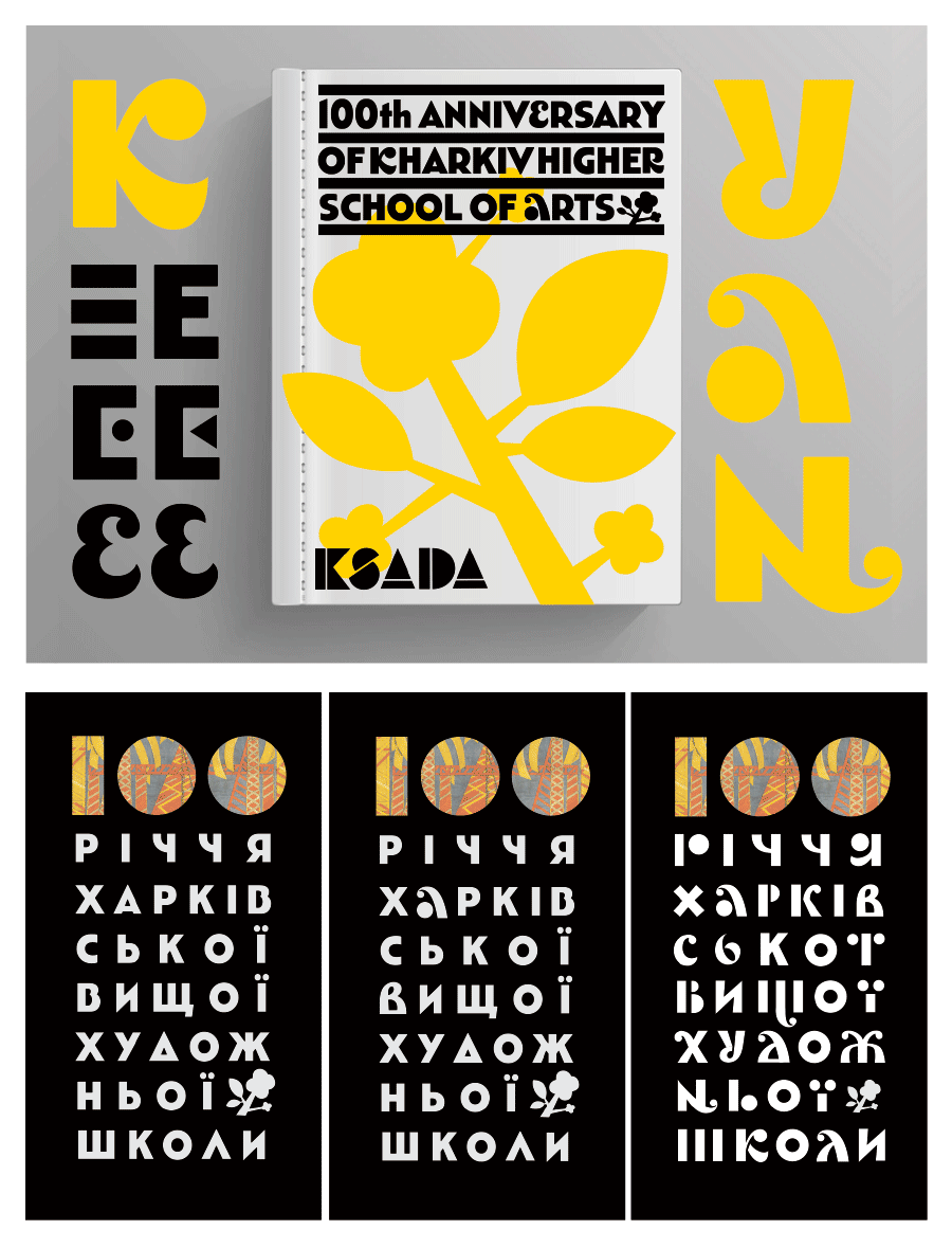
Also, in the blocks of anniversary text I have randomly changed the letter drawing variants. This is not only a very modern method in the context of variable fonts, but also a great way to show the diverse styles and personalities in the choir of the Kharkiv art school.
Unfortunately, we do not know exactly who of the artists made a sketch for the ceramics mounted over the entrance to the School of Arts, but there is every reason to assume that the sketch was painted either by Vasyl Yermilov or someone under his guidance.
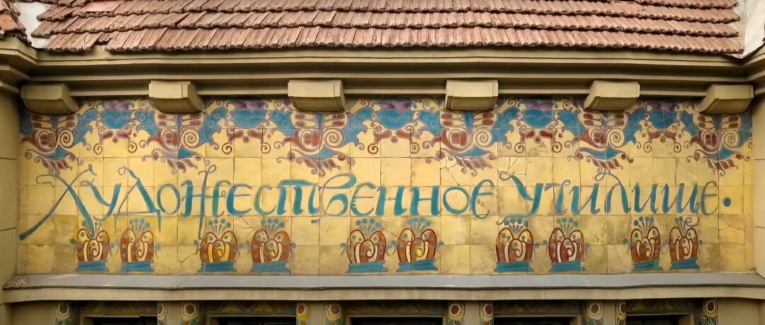
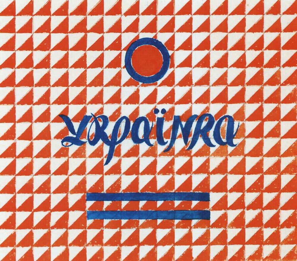
It would suffice to see the shape of the letter “У” in his design for the Ukrainka cigarettes and compare it with “У” in the word «Училище» [School].
In the same way we can analyze Yermilov’s caption “Ivan Franko”, where interpretation of the cursive tradition is linked to the specific features of author’s graphics, such as loops, stroke ends, and contrast.

As noted by the Kyiv researcher Olha Lahutenko, Mykhailo Zhuk also strived to bring inscriptions closer to the Ukrainian style. In writing the letters «т» and «п» he used a pentagonal calligraphic form, an element of windows and doors in folk architecture, which has become a distinct feature of buildings in the new Ukrainian style[30].
Of course, I could have chosen to orientate myself in this project toward other, no less influential Kharkiv or Ukrainian artists. However, in this context, a direct continuation of the Narbut tradition would have been too historical, while the rigid captions of posters by Adolf Strakhov would be too much in the Soviet propaganda style, and the works by Vadym Meller have few handwritten features. I wanted to combine times, create an interplay, which exists in the West between the futuristic madness of Ardengo Soffici[31] and the modern virtuoso of letterpress typography, Ben Joosten[32].
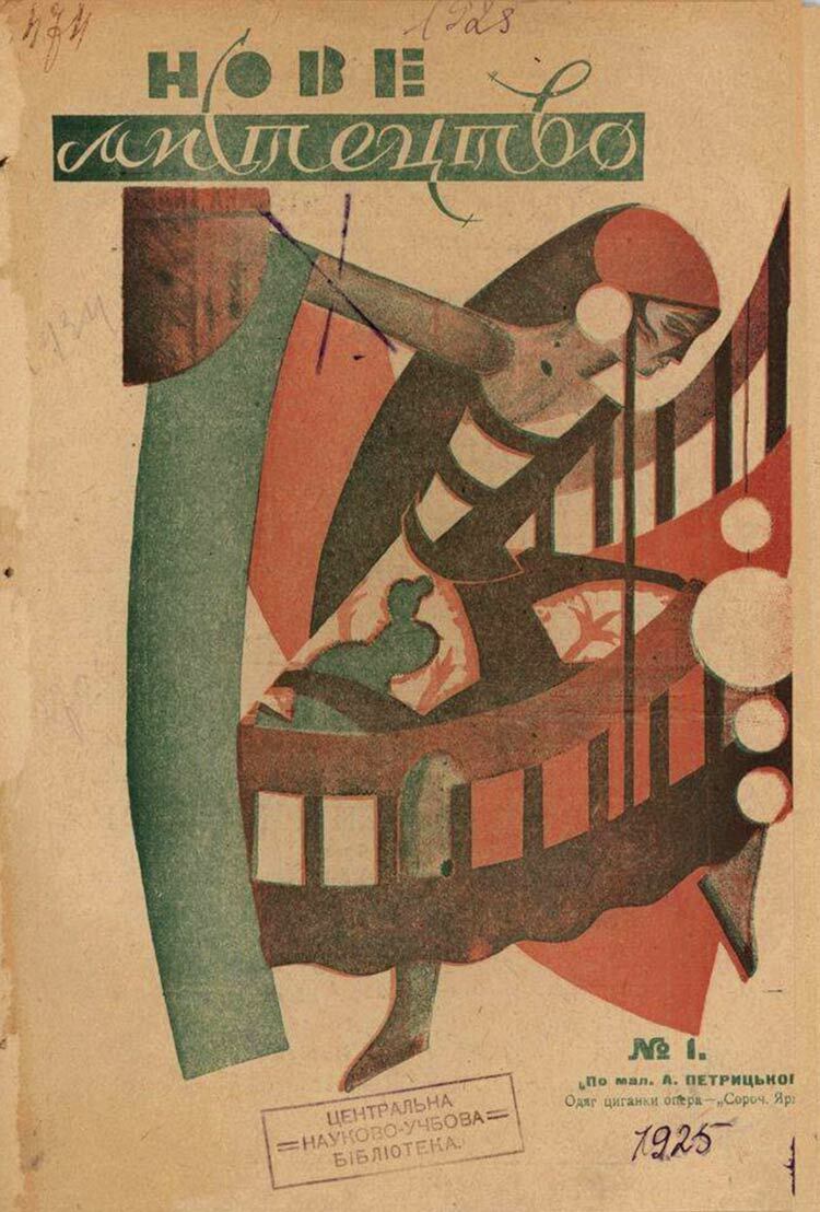
A series of Nove Mystetstvo [New Art][33] covers is very useful for understanding the typographic way of thinking, where joining of fonts of different weight is in a friendly contrast to cursive letters. This is the impression I wanted to convey via the esthetics of the inscriptions.
Having brought all this together, I attempted in the "Kharkiv. Design and Art" composition to realize the variety of approaches and styles; however, without copying but rather by creating a new image, as if looking from within the tradition, but from a 100-year perspective of new trends and ideas.
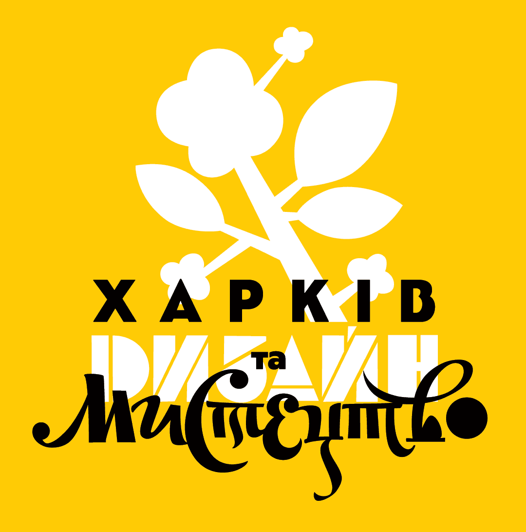
As the main style image, I have chosen a flower from the Puti tvorchestva book cover by Borys Kosarev.
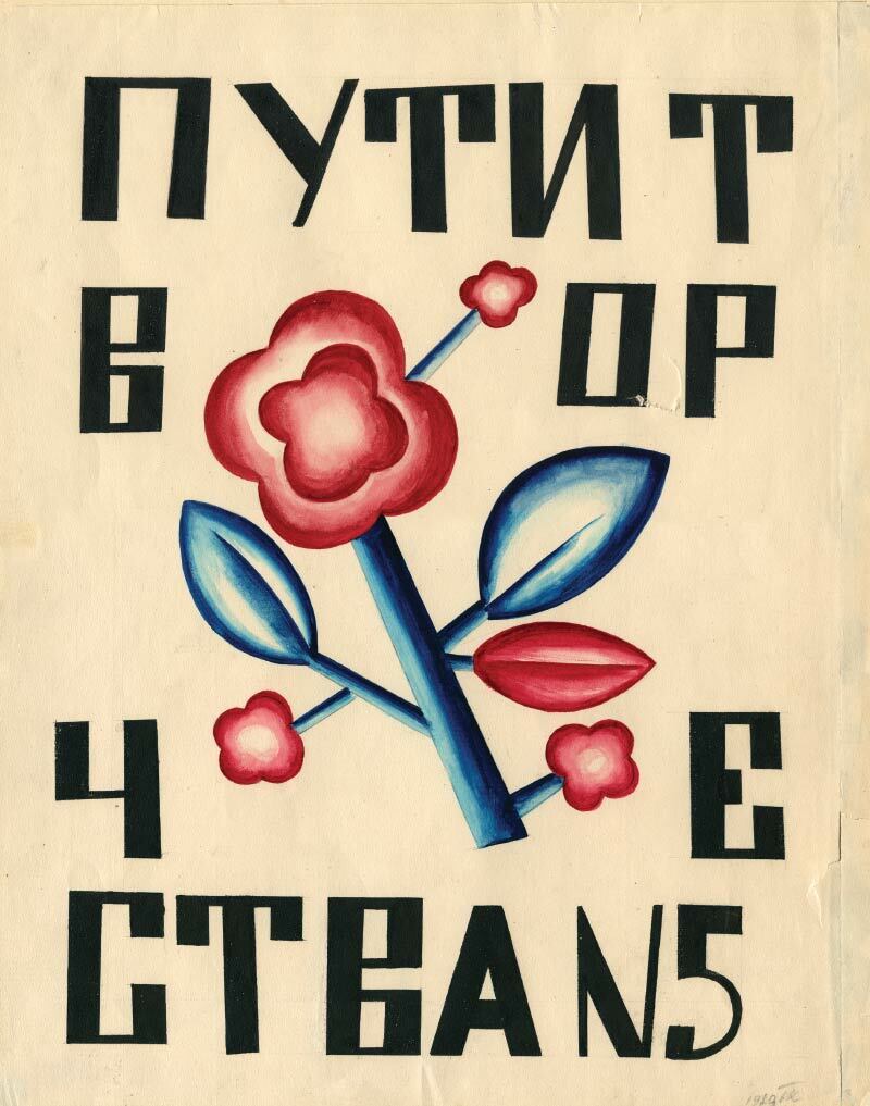
It connects in the best possible way the diverse layers of history of the Ukrainian art – from folk to avant-garde, which simultaneously personifies the flourishing Ukrainian modernism as historical background in various contexts and compositional solutions, as well as represents the postmodernist multimedia pattern.
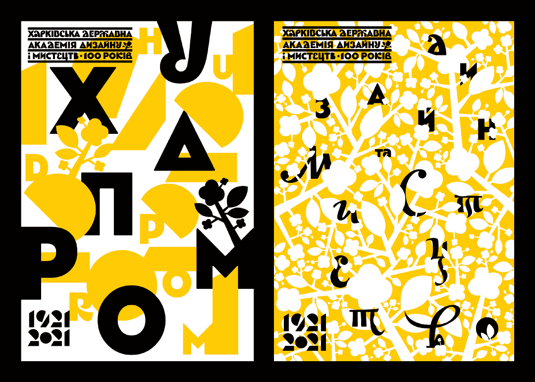
I think it is very important in today’s world, where neutrality is becoming a doubtful standard, to champion the national tone and humanistic approach in art, which is really valuable as artistic expression and which brings Beauty in this world, not just in the context of Stefan Sagmeister’s book[34], but also in the most general Balthasar’s sense, as a bridge between cultures and worldviews[35]. Recently I articulated these thoughts on the topic of identity and individuality in graphic design for the Haded festival[36].
In his book An Essay on Typography published in London in 1931, Eric Gill reflects on divergence between the industrial world and crafts tradition, from which different letter shapes grow[37]. At the same time, however, in his works he managed to connect a nearly epic rooting of inscriptions in the land where they appear. Either carved in stone or written on paper, they soak up the energy of place and time and look equally appropriate both in the design of biblical legends and in inscription on speed trains. So, I also wanted to express in the graphic image and typeface dedicated to the Centenary of Khudprom not only the continuity of the art school, but also the silhouettes of Kharkiv factory chimneys and apple orchards, the strike of Cossack saber and free stride of Hryhorii Skovoroda. I hope I have succeeded in making at least some bridge crossing between these different shores.
The land of frightened fishes and steppe birds.
The land of golden wheat and burnt grasses –
Somebody will write the history of these shores some day,
The history of these riverbeds and these bridge crossings.[38]
List of references
[1] Gleizes, A. and Metzinger, J. O kubizmie [On Cubism] (in Russian, translated from French by Ye.Nizen, edited by Matiushin). Saint Petersburg, 1913.
[2] David Pearson (1978) is a British designer working with Penguin Books since 2002. One of the world’s leading book cover designers. His works pay special attention to a profound master of font language and allegoric thinking.
[3] Edward Johnston (1872-1944), a British typographer who is regarded, with Rudolf Koch, as the father of modern calligraphy; designed the typeface (Sans Serif) for the London Underground in 1916.
[4] Eric Gill (1882-1940), British sculptor, engraver, typeface designer, and writer who is especially famous for his exquisite letters and fonts, and lapidary bas-reliefs.
[5] Ovenden M. Johnston and Gill: Very British Types. Lund Humphries. 2016, p.200.
[6] Unger, G. Theory of Type Design. naio10. 2018. pp.200-203.
[7] Kapr, A. Estetika iskusstva shrifta [Esthetics of the art of font] (in Russian). Moscow: Kniga, 1979. pp.11-12. Albert Kapr (1918-1995), a German calligrapher, printer, and teacher.
[8] Mitchenko, V. Estetyka ukrainskoho rukopysnoho shryftu [Esthetics of Ukrainian script type] (in Ukrainian). Kyiv: Hramota, 2007, pp.21-23.
[9] Rastvortsev, D. Dmytro Rastvortsev longridyt’ za ukrainskyi shryft [Dmytro Rastvortsev’s longread about Ukrainian font] (in Ukrainian). Ukrainskyi dyzain TELEGRAF.2021. No.1, pp.97-108.
[10] Mykhail’ Semenko. Blok-notes: poezii [Block-notes: Poems] (in Ukrainian), 1919. Kyiv: Flamingo, 1919.
[11] Gorbachev, D. Oblozhki i tituly ukrainskoi knigi 20-30-kh godov [Covers and title of Ukrainian books in the 1920-1930s] (in Russian). Sovietskaia grafika 73. Moscow: Sov. khudozhnik, 1974.
[12] Krychevskyi, V. Palochnyi shrift. Dva shrifta odnoi revolutsii [Stick font. Two fonts of one revolution] (in Russian). Dombrovskii, A. Chekhoninskii shrift [Chekhonin’s font] (in Russian). Series: The library of the Shrift journal. Moscow: Masterskaya Barbanelia, 2014, p.224.
[13] Sergei Vasilievich Chekhonin )1878-1936), Russian painter and graphic designer, ceramist, member of the Mir iskusstva (World of Art) arts association.
[14] Film series Ukrainskyi styl z Maksom Rozenfeldom [Ukrainian style with Maks Rozenfeld] (in Ukrainian) created with support from the Ukrainian Cultural Foundation. https://youtu.be/eJ4V3JR7mBA
[15] Adolphe Jean-Marie Mouron (Cassandre), a French painter born in Ukraine, stage designer, and poster artist. Designed the logo for Yves Saint Laurent fashion brand. Made an extraordinary impact on the development of poster and typeface art in the first half of the 20th century.
[16] This is an informal name of the well-known architectural monument built in 1913 by K.Zhukov in the Ukrainian modernism style for the Kharkiv Arts School (it is the KhADAS main building at present).
[17] Savitskaya, L.L, Iskusstvo Ukrainy v kontekste khudozhestvennoi zhizni rubezha viekov. 1890-1910-ye gody [The art of Ukraine in the context of artistic life on the cusp of centuries. 1890s-1910s], (in Russian). Kharkiv: TO Ekskliuziv, 2003, p.315.
[18] Obraztsy shriftov [Type samples] (in Russian). Kharkiv: VUTsIK. JUNE 1923, p.110.
[19] Kurbas: novi svity [Kurbas: New Worlds] (in Ukrainian). Kyiv: DP NKMMK Mystetskyi arsenal. 2019, p.264. Berezil’ was a Ukrainian studio theater founded by Les’ Kurbas in Kyiv in 1922. The theater was moved to Kharkiv in 1926, where it occupied the building of the I.Franko Theater (presently houses the Kharkiv T.Shevchenko Ukrainian Academic Drama Theater). The small stage of this theater bears the name of Berezil’ today.
[20] Yas’kov, V., Khlebnikov. Kosarev. Kharkov (in Russian). Volga. Saratov, 1999. No.11.
[21] Erbar grotesk (1922-1930) is a nonserif font in a geometric style and one of the first designs of this kind released as moveable type. Its author, Jakob Erbar (1878-1935), a German professor of graphic and font design, made the core Erbar series to be one of the first geometric nonserif fonts, thus overcoming Paul Renner’s Futura and Rudolf Koch’s Kabel by approximately five years. Erbar’s goal was to design such a kind of print, which would be free from all individual features, would have fully legible sheet forms, and be a purely typographic creation.
[22] Fomin, D.V., Iskusstvo knigi v kontekste cultury 1920-kh godov [The book art in the context of 1920s culture] (in Russian). Monograph. Moscow: Pashkov dom, 2015, pp.619-680.
[23] Krichevskyi, V.G., Oblozhka: graficheskoe litso epokhi revolutsionnogo natiska, 1917-1937 [Book cover: graphic face of the epoch of revolutionary push, 1917-1937] (in Russian). Vladimir Krichevskyi. Moscow: Samoliot, p.271.
[24] Rypson P., Gęsi N. Polskie projektowanie graficzne 1919-1949 [Polish graphic design 1919-1949] (in Polish). Kraków: Karakter, 2011, p.408.
[25] Lozhkina, A., Permanentna revolutsia. Mystetstvo Ukrainy XX-poch.XXI st. [Permanent revolution. Art of Ukraine of the 20th – early 21st century] (in Ukrainian). KyivL ArtHuss, 2019.
[26] Teatr. Literatura. Muzyka. Balet. Grafika. Zhivopis’. Kino [Theater. Literature. Music. Ballet. Graphics. Painting. Cinema] (in Russian). 1922.
[27] Ruban-Kravchenko, V. Krychevski i ukrainska khudozhnia kultura XX stolittia. Vasyl Krychevskyi [The Krychevskis and Ukrainian art culture of the 20th century, Vasyl Krychevskyi] (in Ukrainian). Kyiv: Krynytsia, 2004.
[28] Gildebrandt, A. Problemy formy v izobrazitelnom iskusstve i sobranie statei [Problems of form in visual arts and collection of articles] (in Russian): abbreviated reprint of 1914 edition. Moscow: Logos, 2011.
[29] Ernst, F. Hrihorii Narbut ta nova ukrainska knyha [Hrihorii Narbut and the new Ukrainian book] (in Ukrainian). Bibiliologichni visti, 1926, No.3(12), p.27.
[30] Lahutenko, O. Hrafichnyi design v Ukraini u pershii tretyni XX stolittia [Graphic design in Ukraine in the first third of the 20th century] (in Ukrainian). Essays in the history of Ukrainian design in the 20 century: A collection of articles. Kyiv: Feniks. 2012, p.254.
[31] Ardengo Soffici (1879-1964), an Italian artist and art critic. One of the founders of futurism.
[32] Hoeks Henk, Lentjes Ewan. Triumf typografii. Kultura, komunikacja, nowe media [Triumph of typography. Culture, communication, new media] (in Polish), p.320. https://d2d.pl/ Ben Joosten (1931-2013), Dutch bronze caster, sculptor, and graphic artist. He collaborated with the Bronze Factory A Cire Perdue Fa in 1957-1971. He made a significant contribution to the development of letterpress typography.
[33] Mudrak, M. “Nova generatsia” i mystetskyi modernizm v Ukraini [“Nova generatsia” and artistic modernism in Ukraine] (in Ukrainian). Kyiv: Rodovid, 2018, p.288.
[34] Beauty. Sagmeister & Walsh. Phaiton Press Limited. 2018, p.280. Stefan Sagmeister, an Austrian graphic designer, storyteller, and typographer based in New York City. He designed album covers for Lou Reed, OK Go, The Rolling Stones, David Byrne, Jay Z, Aerosmith, Talking Heads, Brian Eno and Pat Metheny.
[35] Balthasar, Hans Urs von. The Glory of the Lord: A Theological Aesthetics. Vol. I, Seeing the Form. San Francisco: Ignatius Press, 1983, p.691.
[36] Pro dizain i dizaineriv [About design and designers] (in Ukrainian) HADED Festival. (accessed on 16 September 2021) https://cases.media/column/pro-dizain-i-dizaineriv
[37] Gill E. An Essay on Typography. London: Sheed & Ward, 1931, p.141.
[38] Zhadan, S., Antena [Antenna] (in Ukrainian). Vydavnytsvo 21, p.301.