Cyrillic Script, Ukrainian Language, Swiss Typography: an Interview with Type Designer Nico Inosanto
I recently read a post in the Ukrainian design community about a Swiss type designer named Nico Inosanto, who creates Cyrillic for his fonts, learns the Ukrainian language, and offers his fonts for free to Ukrainian designers. I have always loved Swiss typography, which is very different from Ukrainian that I also admire. I was impressed by Nico's fonts and decided to contact him and talk about our profession. That's how this interview happened.
YS: Could you tell how you first became interested in fonts? What was your aim when you made your first typeface? How long did it take you to create it?
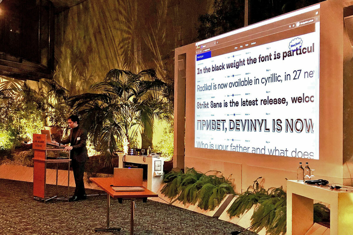
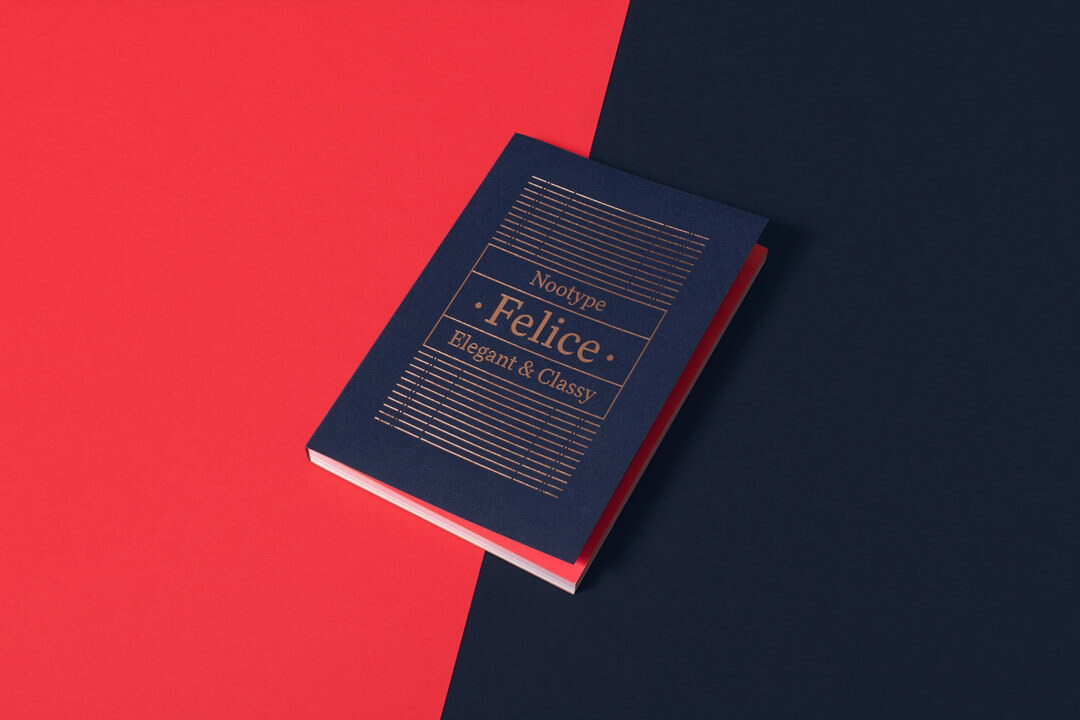
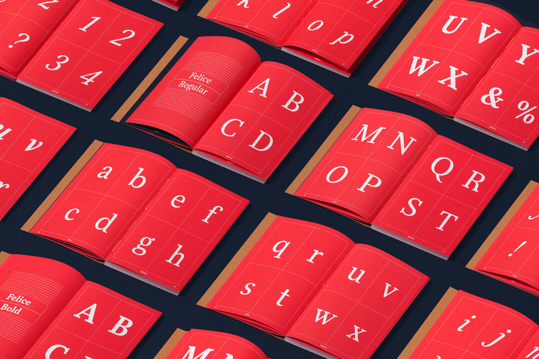
NI: Since the first year in graphic design school in Chaux-de-Fonds, I was fascinated by typography and I quickly wanted to create my first typeface, as an experimentation, and as a challenge because it seemed very long and hard to do. My first typeface was called “Selfico”, it was a serif typeface roughly based on my calligraphic writing, it took me a few months during my vacations, it wasn't for the school, it was an extra project. I remember the last 2 years of my studies, every night after the lessons and the weekends, I was in front of my computer and I was just making new typefaces. At first I sold my typefaces through different retailers, then I hired someone to make a custom e-commerce website for my foundry. Immediately after that I made my first catalogue printed in 2000 copies which I send to many different design agencies around the world, mainly in Europe and North America. 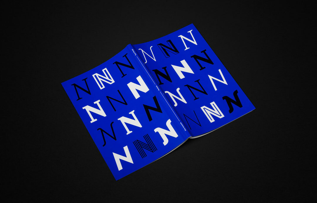
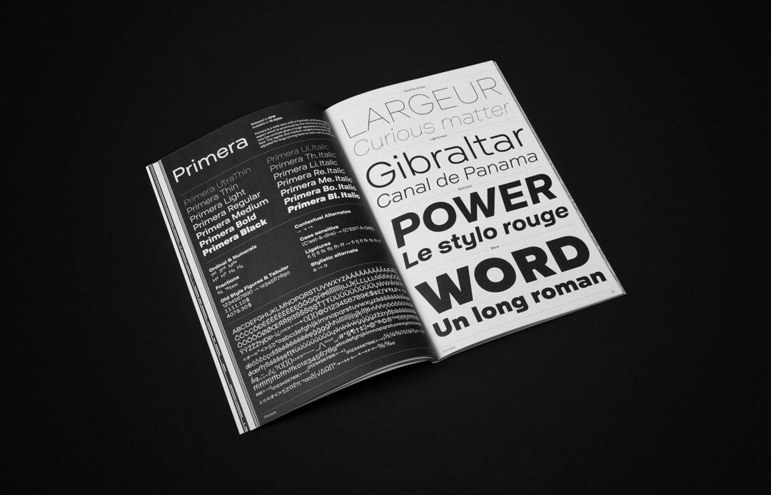
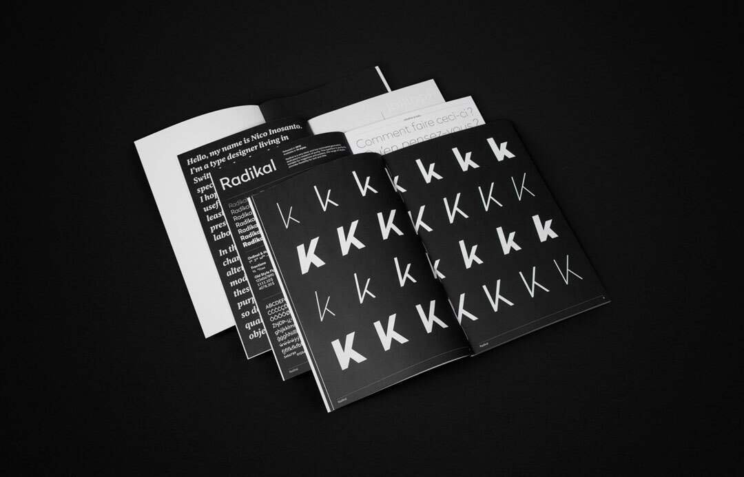
I really like print, so I decided to make small edition of specimen for my typefaces (small books edited in 10-30 copies), which were then sent to people buying entire family of my typeface directly on my website.
YS: What does Helvetica mean to you as a Swiss type designer? Has your attitude to it changed over the years?
NI: I think we can consider it as one of the most “neutral” typeface, a standard, a clean design that influenced and continue to influence the design world. Over the years I don't really think my attitude changed about it, but I think that it's great when contemporary designers use more modern alternatives to it, it's always good to have a little twist and you support living designers.
YS: Do you have a personal hero in the world of type design, a modern or old master who inspires you?
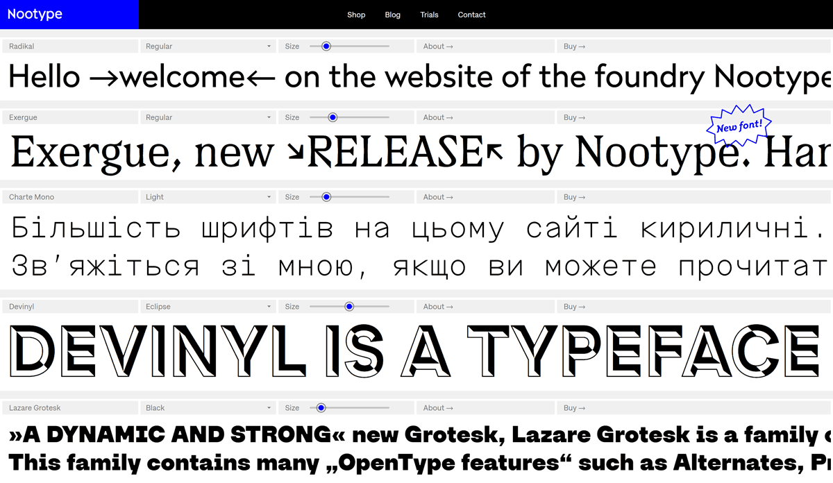
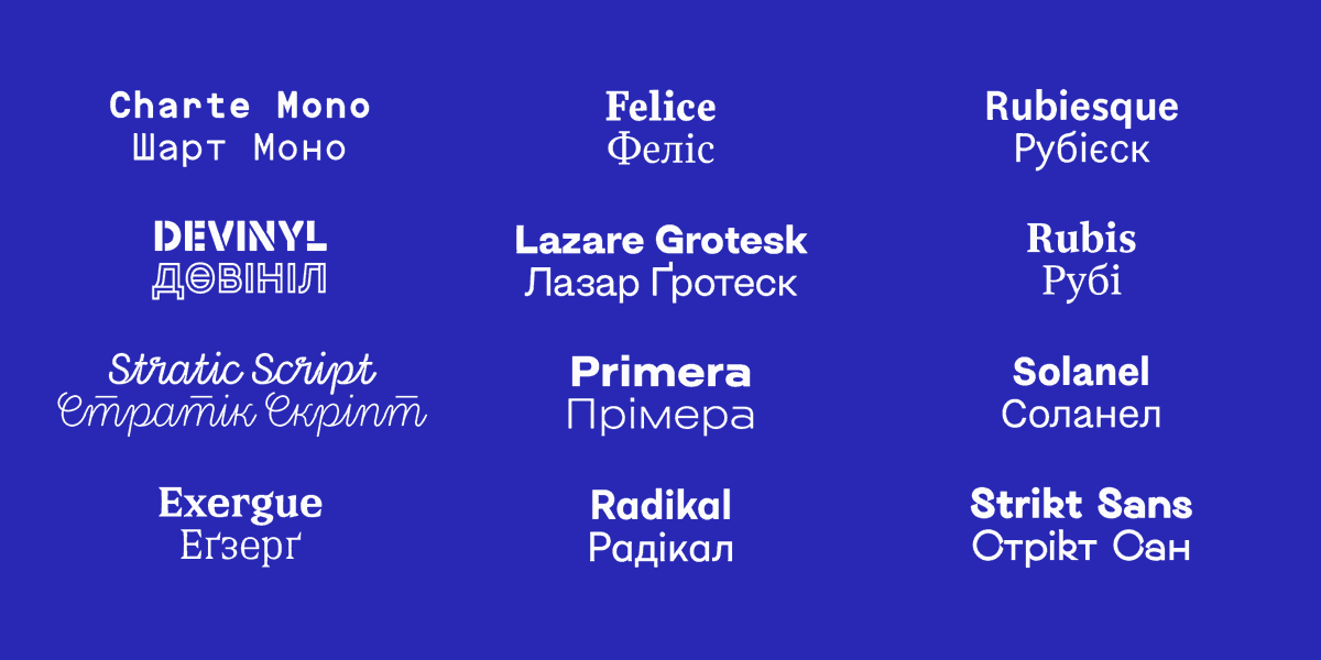
NI: Yes, there are many foundries I appreciate, I especially love the work of Benoît Bodhuin as he is one of the type designers who is always able to reinvent new things in a field where it’s actually becoming more difficult, every year, to realize something that really stands out. Especially in the Latin alphabet which is always getting more crowded, this is one of the reason why I started to extend my typefaces to Cyrillic, and it's not just in Slavic languages, my character set covers most of the countries in Central Asia.
YS: You are learning Ukrainian, and you also make Cyrillic fonts and provide your fonts to Ukrainian designers for free. How and when did you become interested in Ukraine?
NI: Like most people in Western Europe I followed the removal of Viktor Yanukovych in 2014, and even before I saw the Orange Revolution but I don't remember much of that as I was just 10 years old, my interest rised especially since the beginning of the invasion in February 2022, then in Switzerland, I met Ukrainians who flew the war and I started to learn the language.
It's quite complicated for a French native speaker who isn't really familiar with slavic languages. During my research about Ukrainian I found out about LingQ, which is a platform where you learn a language through reading and listening to native content. And its CEO, Steve Kaufmann decided to make LingQ free of use for Ukrainian users and for anyone learning Ukrainian, and I wanted to do something similar, so this is why I'm offering a large portion of my typefaces free to use for Ukrainian designers for their clients in Ukraine. There are a lot of other ways to learn a language for free but I haven't found something as good as LingQ for the moment.
Many Ukrainian designers told me it was difficult to find good Cyrillic fonts that weren't designed by Russian, and even 30 years after the dissolution of the Soviet Union, Moscow continued to drag many young talents from former Soviet Countries. With the war initiated by Russians, it's pretty clear that Ukraine will not go back to their sphere of influence.
Let's back to the language a little bit, one of the reason why I love learning Ukrainian is because how phonetic it is, I know it's not perfectly phonetic (like the в that sounds like a ў or –y with breve– in the end of words and before consonants) but in term of orthography it's very clear and logical.
YS: How often do Ukrainians ask you for fonts? Do you have any interesting examples of your fonts being used in Ukraine?
NI: It depends, some weeks pass without anyone asking for my fonts but when someone post about my offer for Ukrainian designers in a Telegram Channel or in a forum I will get dozens of e-mail and messages. I haven’t seen my fonts used by Ukrainian designers yet, as my offer is relatively recent, but I hope to see them used in Cyrillic.
YS: Cyrillic graphemes have different versions. The Russian version of the Cyrillic is the most widespread today, but there are Bulgarian and Serbian versions as well. Also, in recent decades, the modern Ukrainian Cyrillic has begun to take shape, do you follow our version of the Cyrillic?
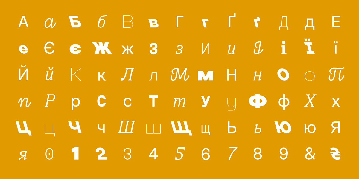
NI: I’ve noticed that many Ukrainian typefaces have alternatives Д and Л, that looks like the capital A without the bar. Similar to the Bulgarian version, I have those alternate in most of my typefaces, but only in Uppercase.
YS: What was your first experience with non-Latin scripts in fonts?
NI: My first and only experience in script other than Latin is Cyrillic, I started to extend my typefaces to Cyrillic in 2019 and I focused on it, I love the fact that my work can be used in many different languages. And Cyrillic is not so different that Latin, the logic of construction and contrasts are similar. Lowercases Cyrillic are much closer to Latin that the Greek alphabet for example, especially in serif typefaces.
YS: What do you know about Ukrainian type design? Are there any Ukrainian fonts or our authors that you recognize for yourself? Or maybe you are familiar with some of them?
NI: Yes, I know some of them, I can cite the foundries Zakznak, AlfaBravo and Mint Type in Ukraine which are both very interesting, and for the other from the Cyrillic which come to my mind, Lettersoup based in Germany with designers from Bulgaria, during my researches in Cyrillic I've come across other foundries which are mentioned in your articles on Medium and Rentafont's blog, I follow some of them on Social Media. By the way, I'm know that there is also a market in Ukraine for typefaces and I'm aware that my offer is some “unfair competition”, of course it would be even greater to support the local type designers, my offer is limited to a selection of typefaces I've made until now, my next ones won't be part of the package.
YS: Do you work with corpora of languages, making fonts that will be used mainly within one language? Perhaps the font for the University of Technology of Warsaw is such a case?
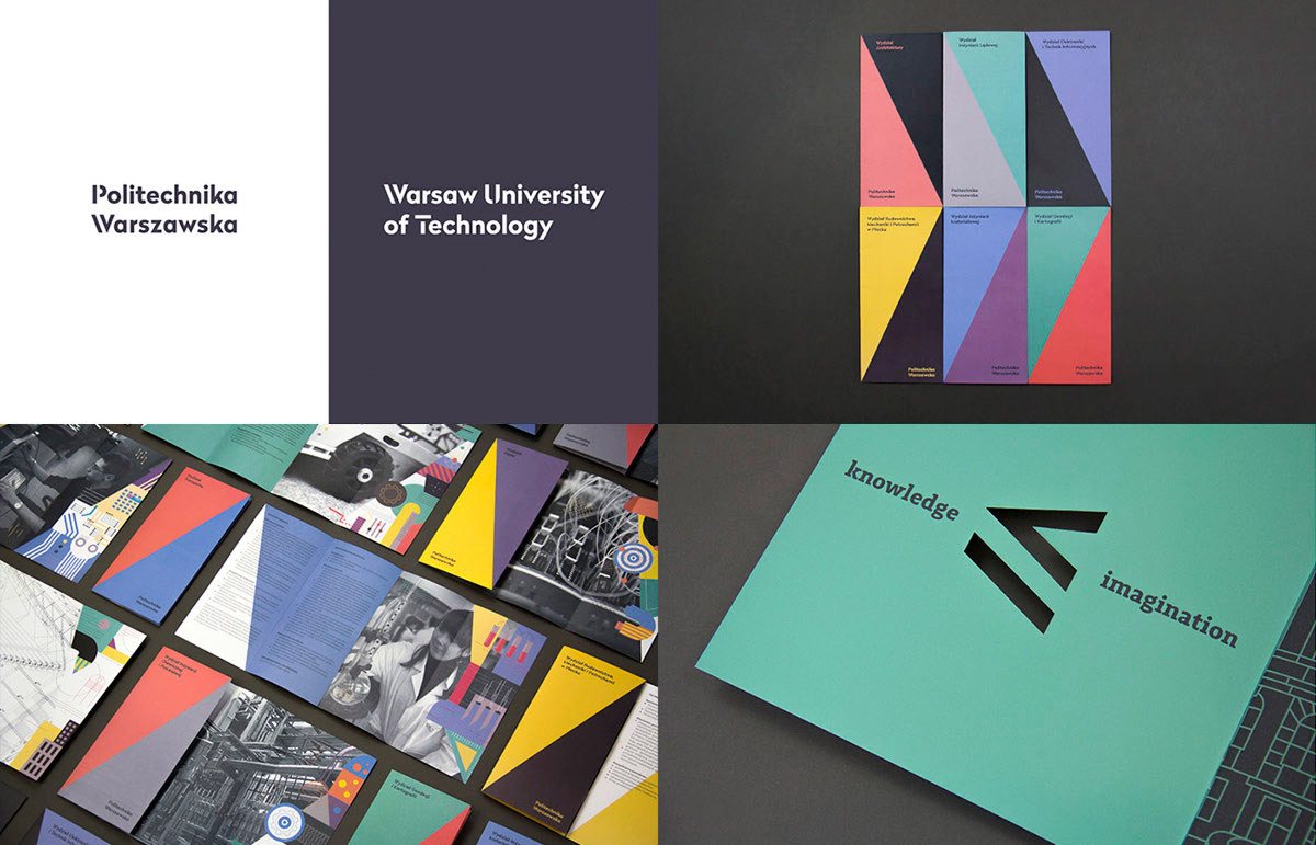
NI: In general I make fonts that will works well in at least 100 different languages, financially speaking, English would be of course the most important of them all, but I don't do typefaces that will specifically work better in this language. I always start with Latin characters, and in Glyphs I write some text with basic letters, then when I have more letters I test my fonts in French and English as I can quickly type words, then as I add more character I make more tests in different languages. For the University of Technology of Warsaw, which was commissioned by the studio Podpunkt, it wasn't specifically made to works better in Polish than in other languages, but nonetheless it was important to make sure that diacritics were corrects, like it's explained in the website of Adam Twardoch. It's important to refer to specialists when you don't know the language or specific signs/accents, and a lot of resources are available online.
YS: How do you see the near future of type design in terms of the oppositions of humanity/technology, global/national?
NI: With all the progress we see in the domain of AI, more and more things will be automatized in the future, very long process like kerning or even adding new scripts could be shorter, with someone behind to check if everything is made correctly.
I see often big companies, at least in Switzerland, hiring local company to make custom typefaces for their own needs, I think in many cases client will prefer to work with local designers. Of course I like the international side of my job, to see my typefaces used in many different countries is always a pleasure, private companies can decide with who they prefer to work, but for public company funded by government or local communities it would be preferable to pay and hire local designers, in my opinion.