95,000 Font Pairs for Logos, Headings, Subheadings
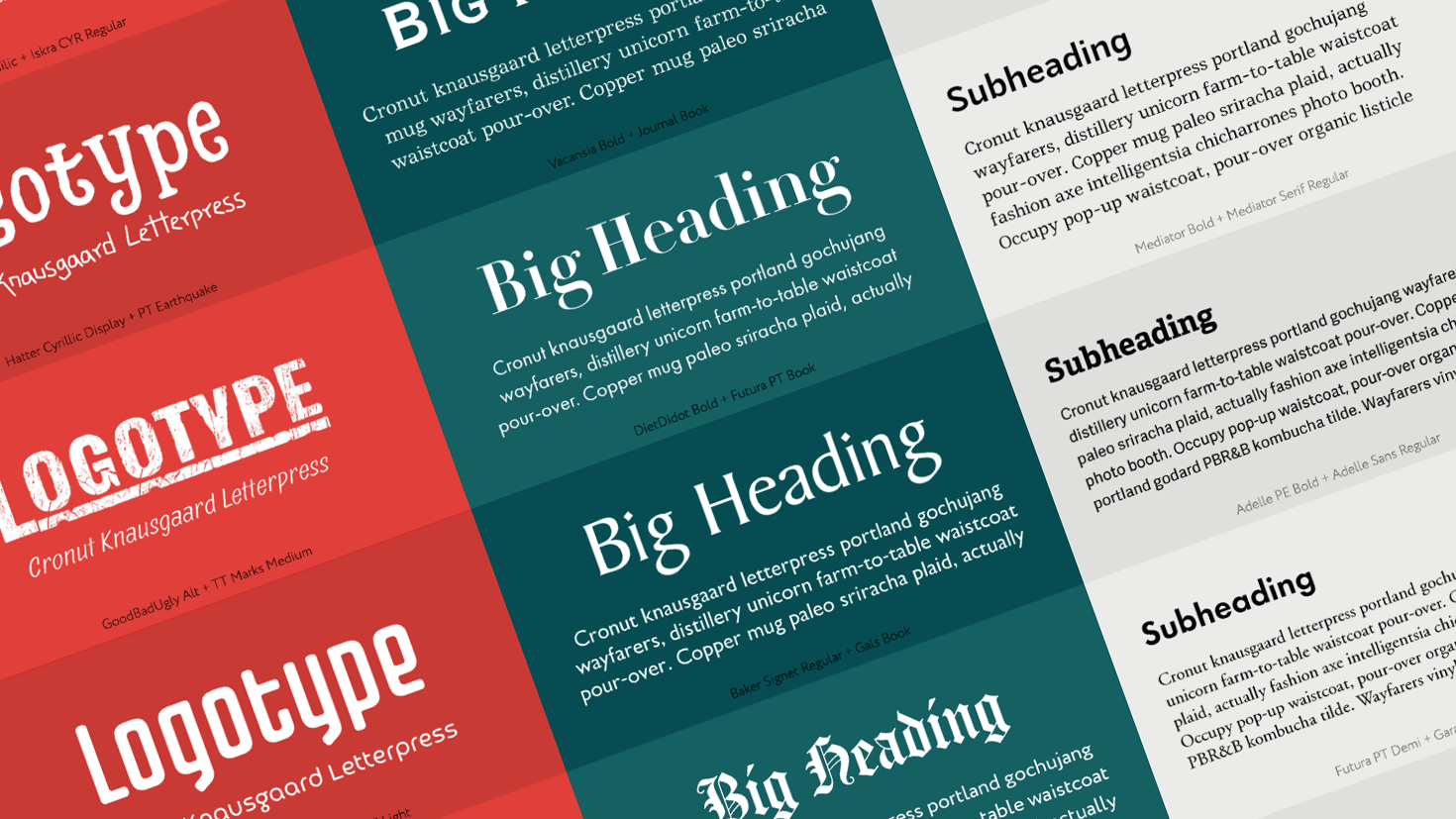
How many fonts do you need to make a poster? Using one font only provides very limited options, while including too many fonts within one design usually looks unconvincing, even unprofessional. A good design is based on a successful combination of several fonts. A pair of font styles of a single typeface or a couple of different typefaces allows you to build a visual and semantic hierarchy, create a mood and convey the information.
But finding a good combination can be a real struggle for designers. The main font can be very difficult to choose, but the requirements to the second font are even stricter. You likely have a couple of successful font combinations in mind, but being able to understand the principles and always have a rich selection would help any designer.
To save your time and create an abundance of choice for any occasion, we have put together the experience of typography professionals and created the Font Pairing Helper!
To compose our lists of font combinations, we take into account more than 20 characteristics for each font, including style, weight, mood etc. This helps us advice on the best font pairs for logos, headings and subheadings.
1. Font Pairs for Logos
This is a combination of a large expressive title and a small caption. Such pairs are most often seen in logos, magazine covers and advertising banners. The examples below present fonts of different classes that have some kind of relationship, most often based on mood or even more subtle traces. They are combined like tea with croissants or a hamburger with French fries.
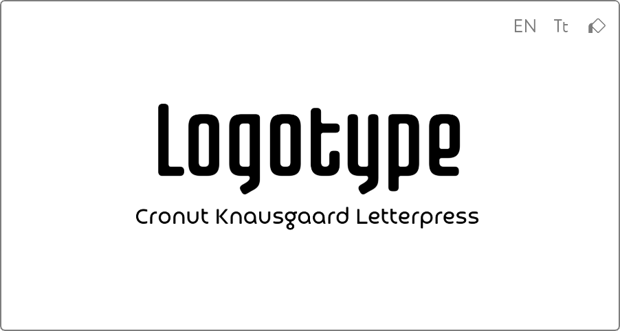 Retro Futuristic Logo Font Pair Fontatica 4F Regular + Croogla 4F Light
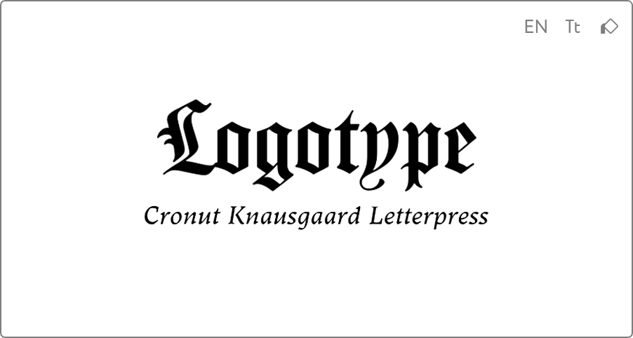 Medieval Logo Font Pair Carol Gothic Regular + Ladoga Text Italic
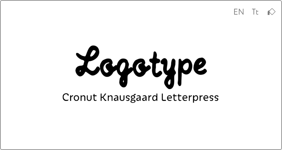 Handwritten Logo Font Pair TT Compotes Basilic + Iskra CYR Regular
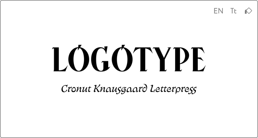 Ukrainian Logo Font Pair Kalyna Regular + Bogdan Rejestrowy
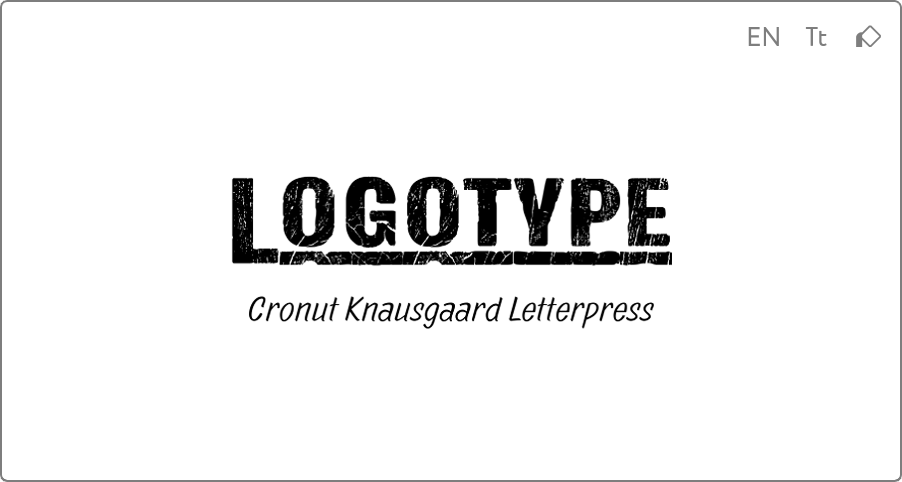 Vintage Logo Font Pair GoodBadUgly Alt + TT Marks Medium
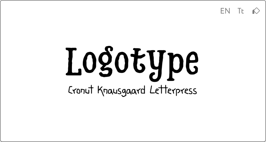 Halloween Logo Font Pair Hatter Cyrillic Display + PT Earthquake
2. Contrast Font Pairs for Headings
This is a combination of a large headline and a small text, such as an announcement or insert. A good solution for magazine or website articles. Fonts in such pair can be complete opposites, but they complement each other perfectly, like ice and fire.
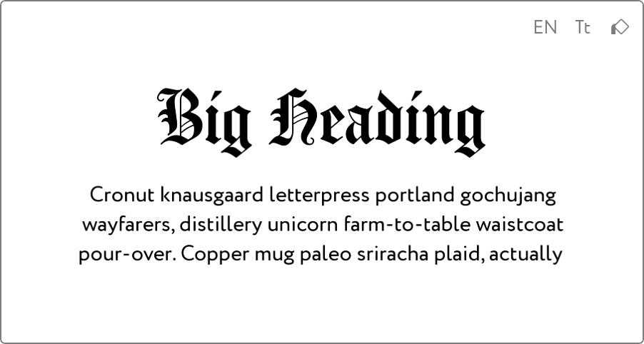 Trendy Heading Font Pair Carol Gothic Regular + Circe Regular
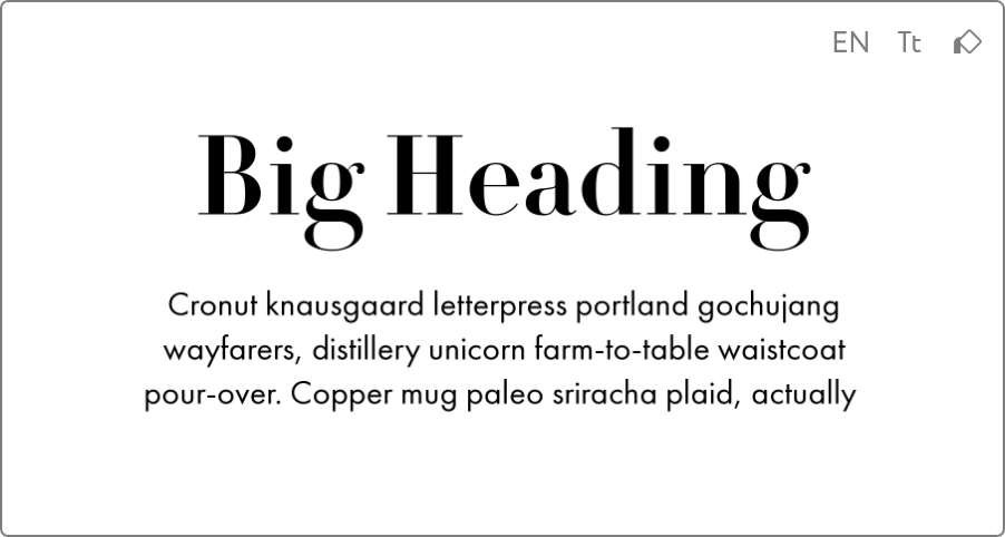 Fashion Heading Font Pair DietDidot Bold + Futura PT Book
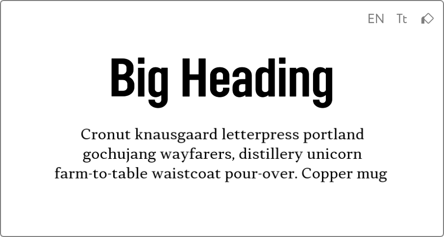 Modern Heading Font Pair Opinion Pro Condensed Bold + Skema Pro Omni Regular
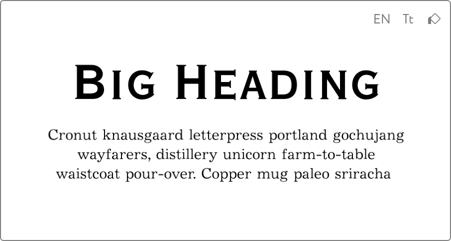 Retro Heading Font Pair Vacansia Bold + Journal Book
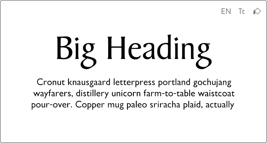 Noble Heading Font Pair Baker Signet Regular + Gals Book
3. Body Text Font Pairs
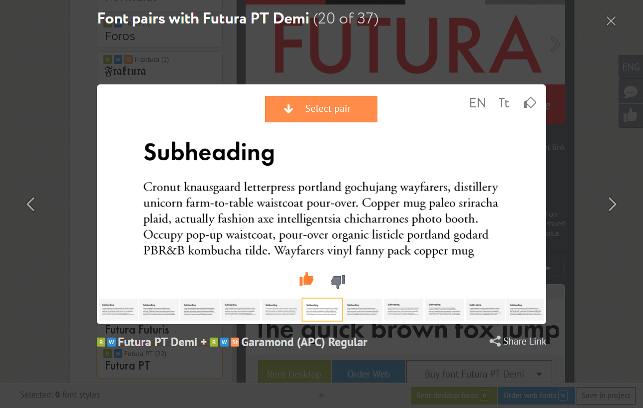
This is a combination of a neat subheading and plain text. The pair is useful for articles with a complex structure, where multiple subtitles and selections inside the text are included. These are mostly “workhorse” typefaces: Serifs, Sans Serifs, Slab Serifs.
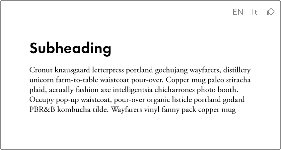 Body Text Font Pair Futura PT Demi + Garamond (APC) Regular
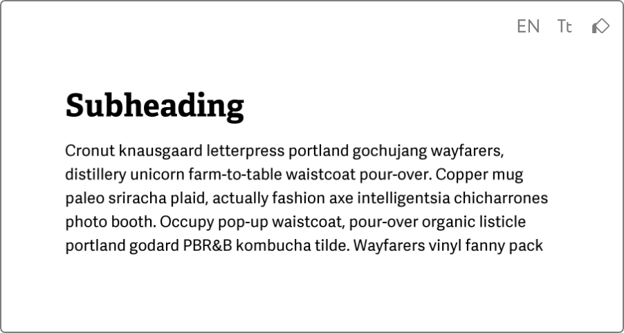 Body Text Font Pair Adelle PE Bold + Adelle Sans Regular
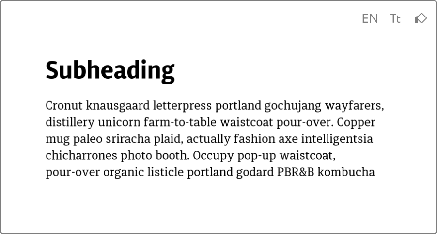 Body Text Font Pair Diaria Sans Pro Bold + Diaria Pro Regular
How to Use Font Pairs on Rentafont
1. Find some fonts, that meet you design objective using the Font Finder. You can use text or search filters.
2. Choose a particular font style to open its page.
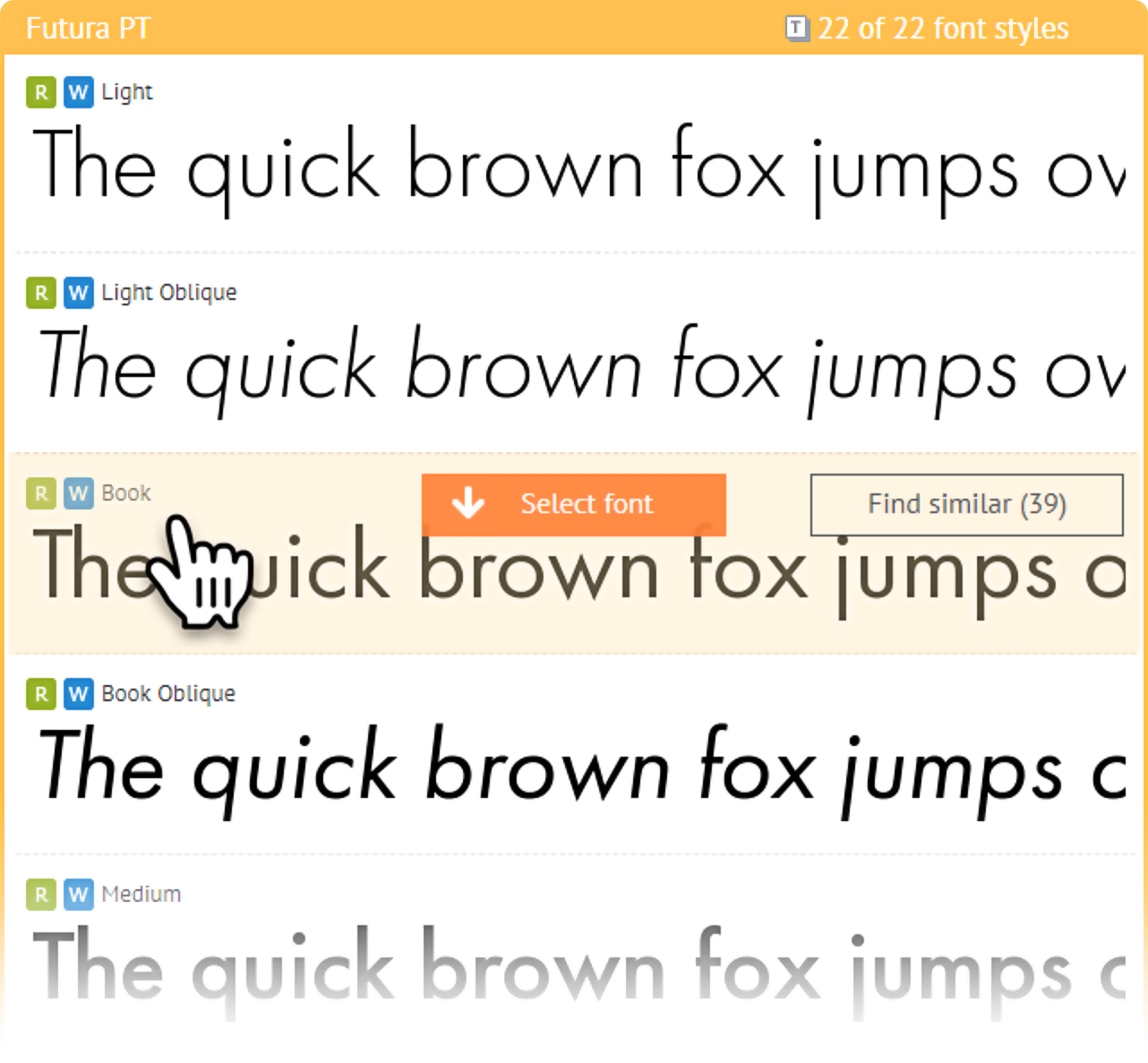
3. On the font page, below the list of all available font styles for a particular family, you will find the available font combinations for the selected style.
Share Your Opinion About Font Combinations
Our new Font Pairing Helper is in the Beta testing mode. Now we have created more than 95,000 multilingual font pairs for you to view and rent.
- If you like some font pair, let us know by pressing Thumb Up (Like)
- If you don’t like some font pair, let us know by pressing Thumb Down (Dislike)
- If there is no pair for the particular font, please let us know by sending a message on info@rentafont.com
Features for the next version:
- A separate Font Pair Index
- Pairs in Font Search and user’s Projects
- Custom Font Pairs, created by users
- Your suggestions?
We will carefully take your opinion into account and update the Font Pairing Helper accordingly.
Have a nice rent! :)